
Better Analyzing Sectors in a Rising Rate Environment
June 15, 2015"I am above the weakness of seeking to establish a sequence of cause and effect"
-Edgar Allan Poe
In today’s post, we’re going to provide 1 month projections for each Sector using the current conditions in rates for the 10 Year Treasury AND price trends for each Sector.
The yield on the 10 Year Treasury finally hit bottom and a two year low in early February of this year. Since that time, with expectations of the Fed’s impending rate hike, it’s been rising steadily. In these environments, so it goes, investors rotate out of sectors like Utilities where the dividends start becoming less appealing, and out of assets like Gold that provide no yield, and into Financials and Insurers that directly profit from higher rates.
There’s a lot of research done to understand how quickly these sector rotations take place, and how much certain stocks typically rise or decline based on % moves in rates. We believe this research is extremely valuable, but we know the common approach is flawed.
The common approach typically starts by finding environments where rates have risen in a similar way historically. This is done by analyzing through a model or market data terminal, when rates risen a certain amount, say 4% over a 3 month period historically, and then seeing what happens next to sectors, industries, etc. The first problem with this approach is that using absolute % moves doesn’t accurately capture similar times historically.
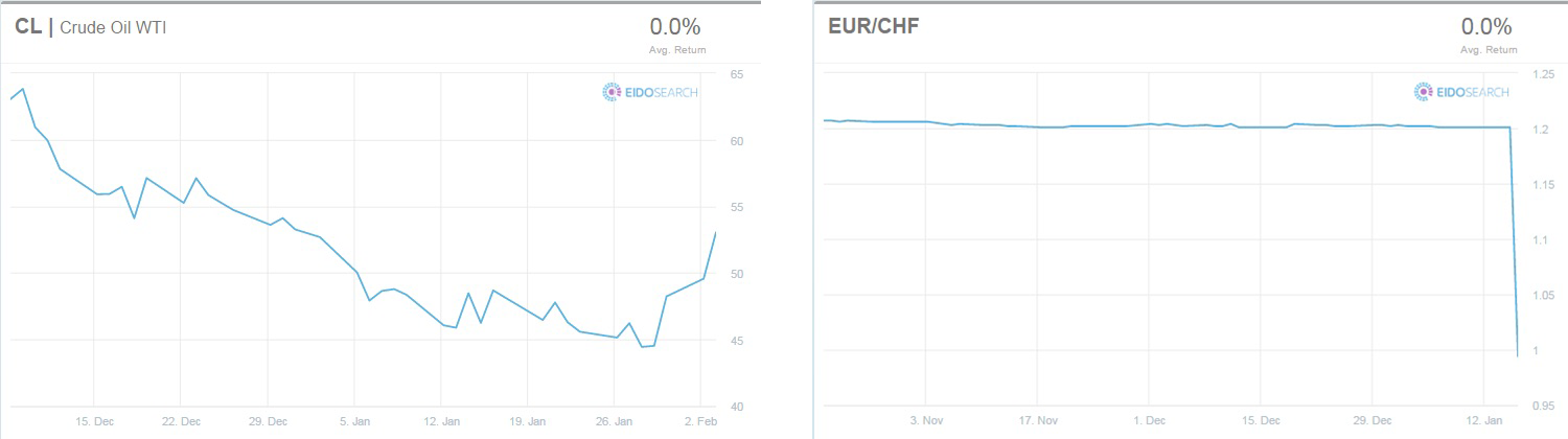
For example, here are two periods we lived through this year with Crude and the Swiss Franc where each asset is down about 20%. In the Crude chart, CL is coming off its lows and rising quickly whereas the Euro is getting clobbered. As an investor, if you’re holding investments in the Euro and Crude, most people would say they feel quite different about each one.
The second and maybe more important reason the common approach is flawed is that with cause and effect you’re typically only taking into account one primary driver. If you’re interested in seeing what sectors perform well in an environment where rates have been rising for a few months, wouldn’t it also make sense to see what’s been happening within each sector over the same period of time as well?
Multi-variant analysis allows you to do just that, and the only way to effectively get at this information is by using the trajectory in the price trends or the “path” of the move. You can’t find times historically in Energy where we had the same capacity in the U.S., OPEC behavior, threats to supply in the Middle East and issues with Russia. However, there have been times where a confluence of industry wide issues have led investors to trade Oil or Nat Gas with similar behavior. Analysis of these trends makes it possible for us to model, and to provide investors with a better gauge.
As promised, we looked at the last 25 years in the 10 Year T-Note (ZN) and each Sector (Morningstar classifications) to find times where both traded in a statistically similar way over the same period of time. You can see the results for which sectors, after these similar periods historically, performed the best in the next month. A few of the sectors had no historical precedent, and are not included:
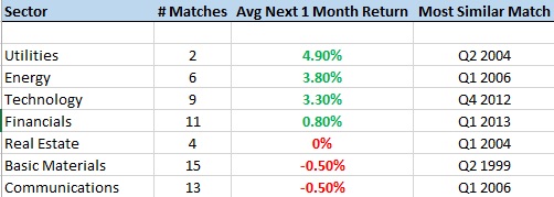
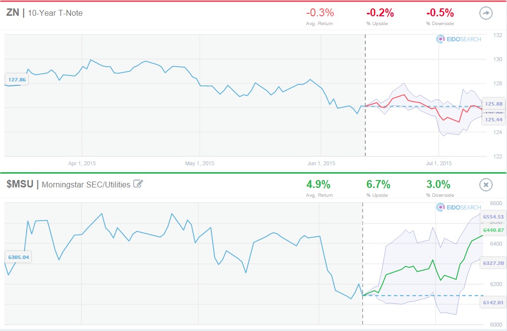
Financials, based on 11 similar environments historically are basically flat which is surprising. It’s also interesting that Utilities have actually done well, although there are only two matches so the results are not statistically significant. Here are the charts for Utilities to bring this study to visual effect.
The image below shows the multi-variant search for the 10 Year and Utilities. Please note, we’re showing the price for the 10 Year and not the yield:
Here are the two similar matches (1996 and 2004), and the returns for Utilities in the next 1 month in each:

Have a great week!